
CSS의 가장 기본적인 문법이다.
사진과 같이 'h1'은 선택자(셀렉터), '{ }'는 선언들이 들어있는 선언 블록, 'color'와 'font-size'는 속성(프로퍼티), 'red'와 '12px'는 속성값(Property value), ' : '는 속성과 속성값을 나눠주는 구분자, ' ; '는 선언과 선언을 나눠주는 구분자다.
선택자(Selector)
선택자의 종류
- 태그 선택자 : 아래 코드와 같이 선택자인 태그 이름만 작성. html에 있는 해당 선택자가 있는 모든 태그에 적용.
<head>
    <style>
        li { color : red;}
    </style>
</head>
<body>
    <ul>
        <li>HTML</li>
        <li>CSS</li>
        <li>JAVA SCRIPT</li>
    </ul>
</body>
- 아이디 선택자 : '#'을 선택자 이름 앞에 붙인다. 딱 하나만 지정할 때 주로 쓴다. 학교로 치면 특정 학생 한 명이라고 생각하면 된다.
<head>
    <style>
        #select { font-size : 50px; }
    </style>
</head>
<body>
    <ul>
        <li>HTML</li>
        <li id="select">CSS</li>
        <li>JAVA SCRIPT</li>
    </ul>
</body>
- 클래스 선택자 : '.'을 선택자 이름 앞에 붙인다. 특정 태그들을 그룹화 시킬때 사용한다. 학교로 치면 특정 학생들을 모아둔 반이라고 생각하면 된다. 서로 다른 태그들도 그룹핑이 가능하다.
<head>
    <style>
        .deactive { text-decoration: line-through; }
    </style>
</head>
<body>
	<h1 class="deactive">수업의 순서<h1>
    <ul>
        <li class="deactive">HTML</li>
        <li>CSS</li>
        <li class="deactive">JAVA SCRIPT</li>
    </ul>
</body>
- 부모 자식 선택자 : 여러가지 방법으로 선택자를 작성할 수 있다.
- ' ' : 한 칸 공백. '부모-자손'의 관계. 1번 태그 밑에 있는 모든 2번 태그에 css 적용.
- '>' : '부모-자식'의 관계. 1번 태그 바로 밑에 있는 2번 태그에만 css 적용.
- ',' : 동등한 관계. 1번 태그와 2번 태그에 같은 css 적용.
(이 외에도 수많은 선택자 선언 방법이 있지만 일단은 기본만 메모. https://flukeout.github.io/에서 문제 풀어보면 다양한 선택자 경험 가능.)
<head>
    <style>
        ul li{
            color:red;
        }
        #lecture>li{
            border:1px solid red;
        }
        ul,ol {
            background-color: powderblue;
        }
    </style>
</head>
<body>
    <ul>
        <li>HTML</li>
        <li>CSS</li>
        <li>JAVA SCRIPT</li>
    </ul>
    <ol id="lecture">
        <li>HTML</li>
        <li>CSS
            <ol>
                <li>selector</li>
                <li>declaration</li>
            </ol>
        </li>
        <li>JAVA SCRIPT</li>
    </ol>
</body>
가상클래스선택자
<head>
    <style>
        a:link {
            color:black;
        }
        a:visited {
            color:red;
        }
        a:hover {
            color:yellow;
        }
        a:active {
            color:green;
        }
        a:focus {
            color:white;
        }
    </style>
</head>
<body>
    <a href="https://google.com">구글</a>
    <a href="https://naver.com">네이버</a>
</body>- :link : 방문하지 않은 링크
- :visited : 방문한 링크
- :hover : 마우스가 올라가 있을 때
- :active : 마우스가 눌렸을 때
- :focus : 'tab'키를 누르면 포커스될 때
속성(Property)
font-size
px, em, rem 3가지의 단위가 있지만, 오늘 날에 가장 사용 권장되는 단위는 rem이다. 이유는 px는 사용자가 직접 폰트 사이즈를 조절이 안된다. 즉 폰트 사이즈가 완전히 고정된다. 하지만 rem은 사용자가 브라우저 등에서 어떻게 설정하냐에 따라 조절이 가능하기 때문에 rem 사용이 권장된다.
color
color name, rgb, hex 3가지 방법으로 컬러를 설정할 수 있다.
ex) color : blue / color : rgb(255, 255, 255) / color : #00FF00
text-align(글 정렬)
left, right, center 등으로 글 정렬이 가능하고, justify를 사용하면 왼쪽 오른쪽 어느정도 균등하게 정렬이 가능하다.
font-family
글꼴(폰트)를 지정하는 속성으로 여러 개의 글꼴을 쉼표(,)로 구분해서 나열할 수 있다.
ex) font-family: "첫 번째 폰트", "두 번째 폰트", "세 번째 폰트", 일반 글꼴; -> 이름에 공백이 없는 글꼴은 따옴표 제거 가능
여기서 앞쪽 글꼴이 사용자 시스템에 없으면 다음 글꼴을 순대로 시도한다. 마지막에는 일반적인 글꼴계열인 serif, sans-serif를 사용하는 것이 좋다. (serif는 글자 끝에 작은 장식이 있는 형태고, sans-serif는 없다.)
font-weight
폰트의 두께를 나타낸다. 대체로 bold(두껍게)만 기억하면 된다.
line-height
글의 행과 행 사이의 간격을 조절한다. 디폴트가 1.2로 현재 설정된 글자 크기의 1.2배 만큼 띈다는 뜻이다.
ex) line-height: 1.2;
font
폰트와 관련된 여러 속성을 축약형으로 표현하는 속성이다. 다음의 순서를 지켜서 작성해야 한다.
font: font-style font-variant font-weight font-size/line-height font-family
캐스케이딩(Cascading)
CSS에서 여러 개의 스타일이 중복될 시에 스타일 우선 순위에 관한 것이다.
1. style attribute
2. id selector
3. class selector
4. tag selector
다음과 같은 순서대로 우선 순위가 정해지며, 만약 우선 순위가 꼬여서 급하게 어느 한 가지를 1순위로 적용하고 싶을때는 내가 원하는 효과 뒤에 '!important'를 적어주면 된다.
ex) li {color:red !important;}
inline vs block
<!DOCTYPE html>
<html>
<head>
    <style>
        h1, a{border : 1px solid red;}
    </style>
</head>
<body>
    <h1>Hello World!</h1>
    hello <a href="">hello</a> hello
</body>
</html>
이와 같이 html을 작성하면,

해당 이미지와 같이 표시가 된다.
여기서 <a>태그는 inline element, <h1>태그는 block level element라고 한다. 우리는 여기서 'display' 속성을 이용해 얼마든지 inline과 block을 지정해줄 수 있다.
<!DOCTYPE html>
<html>
<head>
    <style>
        h1, a{border : 1px solid red;}
        h1{display: inline;}
        a{display: block;}
    </style>
</head>
<body>
    <h1>Hello World!</h1>
    hello <a href="">hello</a> hello
</body>
</html>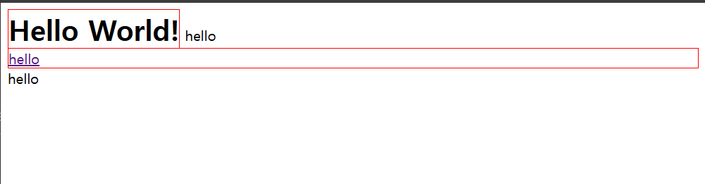
box model
<!DOCTYPE html>
<html>
<head>
    <style>
        p, a {
            border: 10px solid red;
            padding: 20px;
            margin: 40px;
            width: 120px;
            height: 150px;
        }
    </style>
</head>
<body>
    <p>
        Lorem ipsum dolor sit, amet consectetur adipisicing elit. Ratione, impedit?
    </p>
    <p>
        Lorem ipsum dolor sit, amet consectetur adipisicing elit. Ratione, impedit?
    </p>
    안녕하세요. <a href="http//:a.com">영발</a>입니다.
</body>
</html>
위와 같이 html과 css를 작성해 보았다.

이와 같이 화면이 만들어지는데 설명을 하자면,
- padding : 텍스트와 보더 사이 공간
- margin : 보더와 다른 element사이의 공간
- width : 박스의 너비
- height : 박스의 높이
하지만, 위에서 알 수 있듯이 <p>태그에는 width와 height가 적용이 됐지만, <a>태그에는 적용이 되지 않았다. 즉 block element는 width와 height가 적용이 되지만, inline element는 적용이 되지 않는다.
box-sizing
<!DOCTYPE html>
<html>
<head>
    <style>
        div {
            margin: 10px;
            width: 150px;
        }
        #small {
            border: 10px solid black;
        }
        #large {
            border: 30px solid black;
        }
    </style>
</head>
<body>
    <div id="small">Hello</div>
    <div id="large">Hello</div>
</body>
</html>
위와 같이 html을 작성했을 때, 결과를 예상해보자.

모든 <div>태그에 대해서 width를 150px로 지정을 했지만 두 element의 크기가 다른 것처럼 보인다. 이는 'box-sizing' 속성이 'content-box'로 기본 설정 되어있기 때문이다. 즉, border가 아닌 content 기준으로 width가 설정되어있기 때문에 위와 같은 결과가 나오는 것이다.
<!DOCTYPE html>
<html>
<head>
    <style>
        div {
            margin: 10px;
            width: 150px;
            box-sizing: border-box;
        }
        #small {
            border: 10px solid black;
        }
        #large {
            border: 30px solid black;
        }
    </style>
</head>
<body>
    <div id="small">Hello</div>
    <div id="large">Hello</div>
</body>
</html>
그래서 이렇게 box-sizing을 border-box로 설정해주면,

다음과 같이 결과가 바뀌게 된다.
마진겹침 현상
<!DOCTYPE html>
<html>
<head>
    <style>
        li {
            margin: 30px;
        }
    </style>
</head>
<body>
    <li>html</li>
    <li>css</li>
    <li>js</li>
</body>
</html>
element들에게 margin을 설정해주면 margin이 겹치는 현상이 나타나는데, 만약 위와 같은 상황에서 margin이 겹치지 않았다면 li태그의 html와 css 글자 사이에 60px나 되는 margin이 생겼을 것이다. element들이 붙어있을 때는 더 큰 마진값의 간격으로 벌어지게 된다는 점도 기억하자.
<!DOCTYPE html>
<html>
<head>
    <style>
        #parent {
            border: 1px solid red;
            margin-top: 100px;
        }
        #child {
            background-color: powderblue;
            margin-top: 50px;
        }
    </style>
</head>
<body>
    <div id="parent">
        <div id="child">
            hello
        </div>
    </div>
</body>
</html>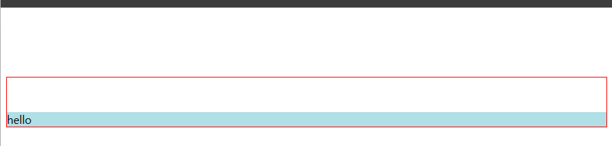
다음은 이와 같이 두 div 태그에 마진이 설정되었을때, 만약 parent 태그의 css에서 border 속성을 빼 버리면 어떻게 될까?

보는 것과 같이 hello가 조금 올라오게 되는데, 태그의 시각적 효과가 없어지면 이와 같이 마진 겹침 현상이 일어나고 parent-child 관계인 태그 안에서도 margin 값이 더 큰 쪽의 마진값이 나머지 하나에 적용이 된다.
추가적으로, 어떤 태그에 만약 margin-top이 100px, margin-bottom이 50px로 설정되어있는 상태에서 해당 태그의 시각적 효과가 없어진다면 해당 태그는 둘 중 더 큰 값의 마진의 값 하나만 적용이 된다.
Position
static, relative
<!DOCTYPE html>
<html>
<head>
    <style>
        html {
            border: 1px solid grey;
        }
        div {
            border: 5px solid tomato;
            margin: 10px;
        }
        #child {
            position: relative;
            left: 100px;
            top: 100px;
        }
    </style>
</head>
<body>
    <div id="other">other</div>
    <div id="parent">parent
        <div id="child">child</div>
    </div>
</body>
</html>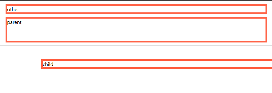
우선 position은 기본 값이 static으로 설정되어있기 때문에 relative로 설정을 해줘야 오프셋 값들이 적용이 된다. 위와 같이 left 값을 주면 그만큼 왼쪽에 공간이 생기고, top에 값을 주면 위쪽에 공간이 생긴다. 참고로 right와 bottom도 있지만 각각 left랑 top이랑 같이 선언됐을 시에 left와 top의 값만 적용된다.
absolute
<!DOCTYPE html>
<html>
<head>
    <style>
        #other, #parent {
            border: 5px solid tomato;
        }
        #child {
            background-color: black;
            color: white;
        }
    </style>
</head>
<body>
    <div id="other">other</div>
    <div id="parent">parent
        <div id="child">child</div>
    </div>
</body>
</html>
position 값 중에는 absolute라는 값이 있다. 만약 이 값을 child에 설정을 해준다면,
<!DOCTYPE html>
<html>
<head>
    <style>
        #other, #parent {
            border: 5px solid tomato;
        }
        #child {
            background-color: black;
            color: white;
            position: absolute;
            top: 0;
            left: 0;
        }
    </style>
</head>
<body>
    <div id="other">other</div>
    <div id="parent">parent
        <div id="child">child</div>
    </div>
</body>
</html>
이와 같이 화면 맨 끝에 붙게 된다. 하지만 여기서 absoulte로 지정만 해주고 top과 left 값을 지정 안한다면,

이렇게 parent 밑에 위치하게 된다. 하지만 absoulte로 position을 설정했기 때문에 parent에서 독립되어 크기가 줄어들고 아까처럼 parent 박스 안에 위치하지 않는 것이다. 즉, 따로 독립이 되긴 했으나 오프셋 값을 설정 안해주면 일단 부모 밑에 붙어 있는다.
<!DOCTYPE html>
<html>
<head>
    <style>
        #other, #parent, #grand {
            border: 5px solid tomato;
        }
        #grand {
            position: relative;
        }
        #child {
            background-color: black;
            color: white;
            position: absolute;
            top: 0;
            left: 0;
        }
    </style>
</head>
<body>
    <div id="other">other</div>
    <div id="grand">grand
        <div id="parent">parent
            <div id="child">child</div>
        </div>
    </div>
</body>
</html>
추가로, 다음과 같이 grand를 추가하고 grand에 relative를 설정하면

원래라면, 아까처럼 화면 맨 위에 붙어야할 child가 grand에 붙어있는 걸 볼 수 있다. 즉, absolute로 설정한 태그는 position이 static하지 않은 부모가 나타날때까지는 html 가장 상단 기준으로 붙다가 static하지 않은 부모가 나타나면 그 태그를 기준으로 위치를 가진다.
fixed
<!DOCTYPE html>
<html>
<head>
    <style>
        #other, #parent {
            border: 5px solid tomato;
        }
        #large {
            height: 10000000px;
            background-color: powderblue;
        }
        #child {
            background-color: black;
            color: white;
            position: fixed;
            top: 0;
            left: 0;
        }
    </style>
</head>
<body>
    <div id="other">other</div>
    <div id="parent">parent
        <div id="child">child</div>
    </div>
    <div id="large">large</div>
</body>
</html>

fixed는 absolute와 비슷하지만 화면에서 스크롤을 내려도 해당 위치에 고정되어 있다.
'공개 글' 카테고리의 다른 글
| Web Server와 WAS (1) | 2025.03.17 |
|---|---|
| CSS 기본 - 2 (0) | 2025.03.13 |
| @GetMapping? @PostMapping? (0) | 2025.02.19 |
| html 기본 태그 (0) | 2025.02.04 |
| API와 REST API (0) | 2025.01.20 |